UX design | 2022
Forbes App
Optimizing the reading experience of the forbes app. Focuses on people’s frustration and goals and come up with the solution that is easy to use and equitable.
Overview
As a 32 Weeks Intensive Design Course from Google UX Program, This UX study aims to understand forbes's users needs and frustration. This project has been done for educational purposes and is in no way made, owned, or affiliated directly with any application
My Role
Role: UX Researcher & UX Designer
Timeline: 6 Days
Context: Personal Project under the mentorship Google Mentors from Coursera.
Research
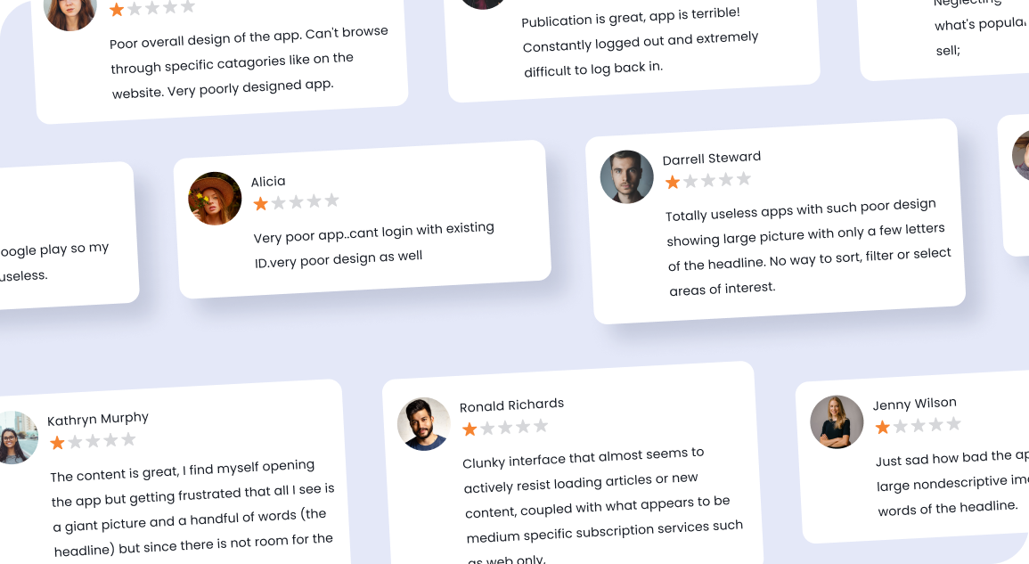
I started my research by reading user reviews on the app store. Many users rated the forbes app low rating mainly because of two reason, first is the design of the app is not good and the user experience of reading articles and news is bad.
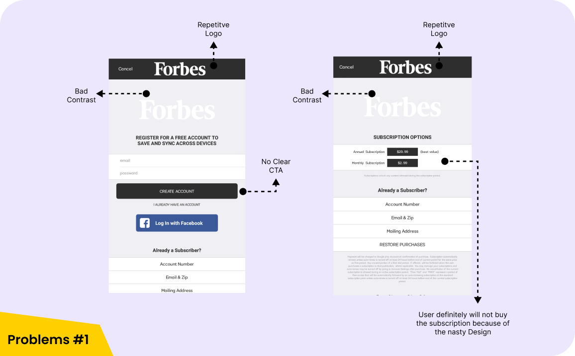
Bad Contrast and CTA
As you can see, Current Forbes app using multiple logo with bad Contrast and the second problem is the Call-To-Action Button, which should be easy to find by the users.
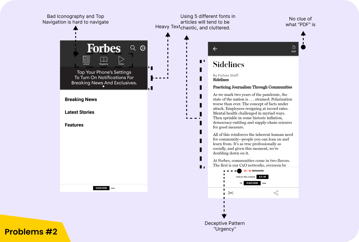
Navigation & Typography
Using Top Navigation Bar is not user-friendly
because it takes more effort to operate compare to bottom Navigation, it's not giving
users a visible
indicator of which screen they are looking at.
Using 5 different fonts from different family makes users confuse/ hard to read
articles.
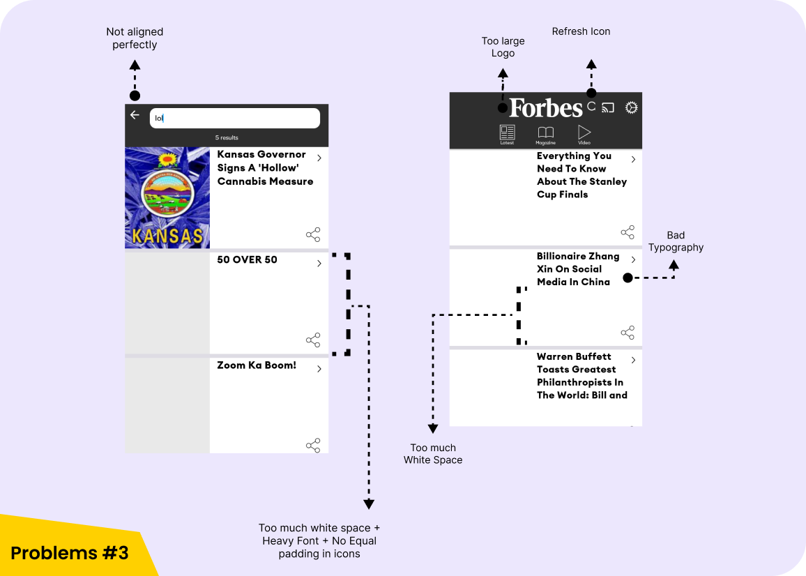
Search Page
No Filters or Categories in the search page. Users can't even save their favourite articles (for later reading). Heavy fonts, Big Images and no other important information like published date, authors, related genre making it worse experience.
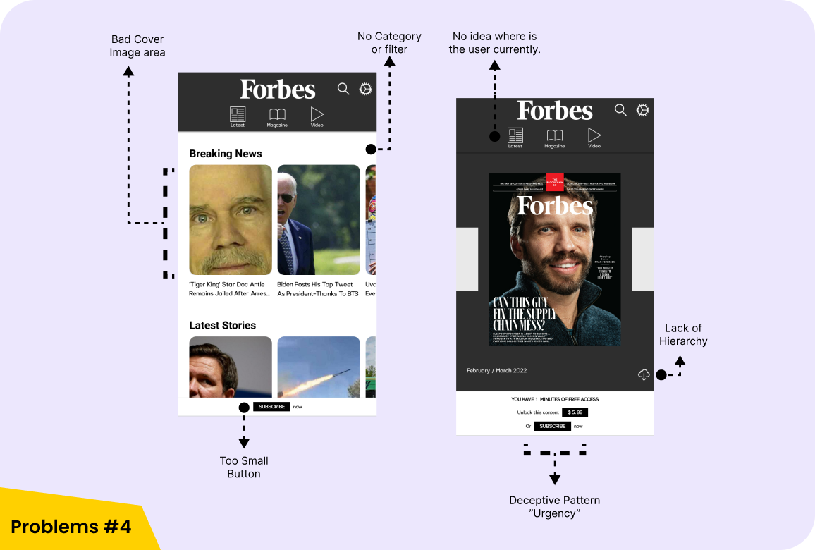
Home and Magazine Screen
Big Clunky image and incomplete title fo the article are stopping users from their goals (reading experience), Reminding people with cute little button to subscribe for a plan is a slimy sales technique to manipulate users into buying up for things.
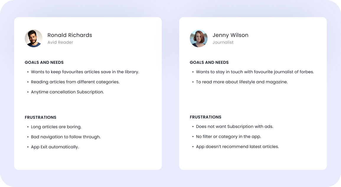
Persona
I prepared user personas on the behalf of user reviews to identify the real frustration issue of the user and to find more about their needs. Personas helped me to achieve the goal of creating a good UX for the target users. It's helps to keep users in mind and their needs.
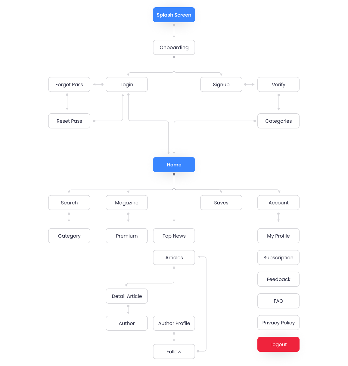
Fixing Current Userflow
Forbes current userflow skipped many important screens to explain what this product do, what users can expect and how It will impact user's life.
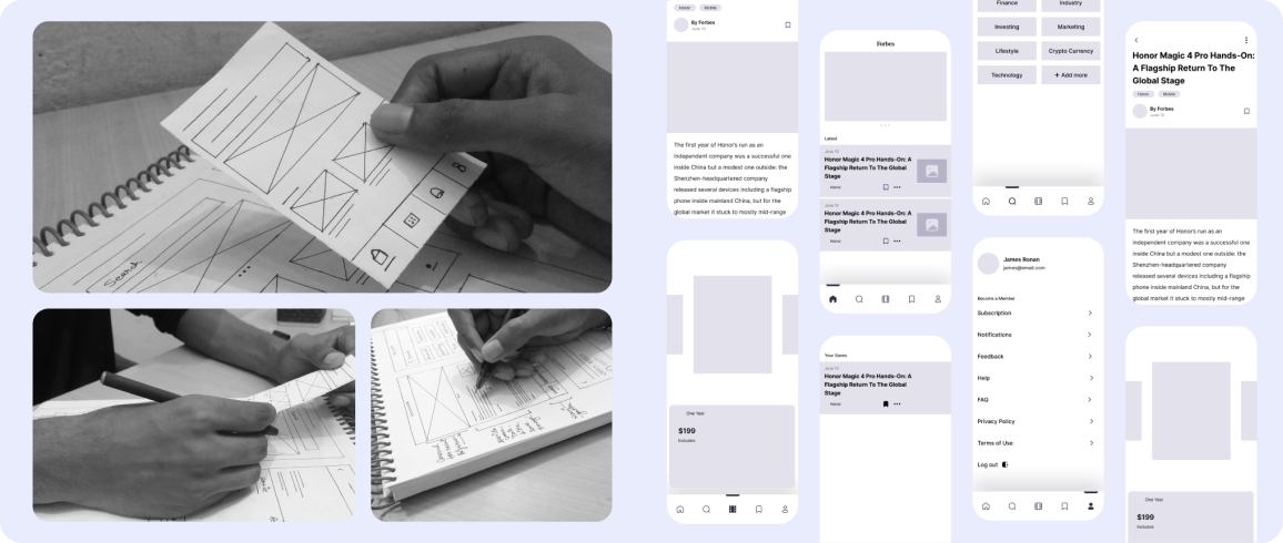
Paper and Digital Wireframes
Started creating digital wireframes to get the right idea of layout. Things like what should be include in Home section which is important and relevant to all end users.
Prototype may take few seconds to load.
Interact with Final Prototype

You can Interact with Final Figma Prototype on Desktop.
Thank You!
Thank you for reading this Case Study! If you liked this let me know your thoughts. You can mail me at uxrishu@gmail.com